In my previous post on generative adversarial networks, I briefly touched upon the concept of a latent space. In the case of machine learning, a latent space can be thought of as a multidimensional parameter space within which we can encode the representation of some arbitrary training data. More concretely, this “representation” is a manifold, on which each training example is mapped to a unique point. Importantly, the dimensionality of a latent space is typically much lower than that of the training data. The idea that many, high-dimensionality real-world datasets (images, speech, text, etc) actually exist on lower-dimensional manifolds is referred to as the manifold hypothesis (a.k.a manifold assumption), and is a fundamental principle in machine learning.
A Brief Interlude…
To get an intuitive feel for the manifold assumption, let’s go through a quick thought experiment. Consider all the possible 128×128 pixel RGB colour images that could ever exist. For each of the three channels, we have a whopping 16,384 pixels, each with a value between 0 and 255 (assuming 8-bit colour depth). From this point of view, an image is merely three unique “points” on three 16,384-dimensional lattices; one each for red, green and blue. If you were to randomly construct an image by sampling all the possible combinations of pixel values, you’d almost always end up with an image resembling random noise.
In fact, there is a site that does exactly this: constructing random images (part of the larger Library of Babel project). Sure enough, every image is noise (though the thought experiment suggests that if you wait long enough you’d supposedly see an image of yourself, check out Solar Sands’ The Canvas of Babel video for more). The Library of Babel website is in homage to the namesake 1941 short story by Jorge Luis Borges, which is set in a labyrinthian library housing a near-infinite collection of all conceivable 410-page books that could ever be written. The concept of this library is closely related to the Infinite Monkey Theorem, which suggests that a monkey randomly typing on a typewriter for an infinite period of time will necessarily write anything. Of course, while it may be plausible that monkeys could band together to write Shakespearian tragedies, you’d have to outlive the heat death of the universe to so much as glimpse an opening act.
Now, if we reverse these analogies, it strongly suggests that the sorts of data we encounter in our daily lives – photographs, sonnets and ballads, treatises on existential nihilism – are infinitesimally small subsets of all the possible kinds of combinations of pixels in an image or words on a page. It therefore seems reasonable to assume that data can be represented using lower-dimensional manifolds. Moreover, data tends to be well structured and correlated, often with high amounts of redundancy (like overly verbose interludes…). Machine learning takes advantage of this structure, cutting through redundancies and instead focusing on the meaningful features innate to the data itself, such as patterns in an image, or keywords in an essay.
The Shape of Data
Dimensionality reduction is nothing new (at least compared to current-day deep learning), and is a well established statistical technique for reducing data into a more meaningful, lower dimensional form. In this post, we will took to visualise the latent spaces of a convolutional neural network (CNN) using several dimensionality reduction methods: principal component analysis (PCA), t-distributed stochastic neighbour embedding (t-SNE), and Uniform Manifold Approximation and Projection (UMAP).
The latent space of our CNN are the outputs of its penultimate, fully-connected dense layer. Let’s quickly construct a CNN and train it to classify images from the CIFAR-10 dataset.
import tensorflow as tf
from tensorflow import keras
from tensorflow.keras import layers
import numpy as np
import matplotlib.pyplot as plt

# load data
(X_train, y_train), (X_test, y_test) = keras.datasets.cifar10.load_data()
X_train = X_train.astype('float32')/255.
X_test = X_test.astype('float32')/255.
y_train = keras.utils.to_categorical(y_train)
y_test = keras.utils.to_categorical(y_test)

# define model
model = keras.Sequential([
    layers.Conv2D(32, kernel_size=3, padding='same', use_bias=False, input_shape=(32,32,3)),
    layers.BatchNormalization(),
    layers.ReLU(),
    layers.MaxPool2D(pool_size=(2,2)),
    layers.Conv2D(64, kernel_size=3, padding='same', use_bias=False),
    layers.BatchNormalization(),
    layers.ReLU(),
    layers.MaxPool2D(pool_size=(2,2)),
    layers.Conv2D(128, kernel_size=3, padding='same', use_bias=False),
    layers.BatchNormalization(),
    layers.ReLU(),
    layers.MaxPool2D(pool_size=(2,2)),
    layers.Flatten(),
    layers.Dense(128, activation='relu'),
    layers.Dense(10, activation='softmax')
])

# compile it
model.compile(
    optimizer=keras.optimizers.Adam(learning_rate=1e-3),
    loss=keras.losses.CategoricalCrossentropy(),
    metrics=['accuracy']
)

# train
hist = model.fit(
    X_train, y_train, batch_size=128, epochs=50,
    validation_data = (X_test, y_test),
    callbacks = [
        keras.callbacks.ModelCheckpoint('best.hdf5',save_best_only=True,save_weights_only=True),
        keras.callbacks.EarlyStopping(patience=7)
    ]
)

# evaluate
model.load_weights('best.hdf5')
model.evaluate(X_test, y_test)
# 313/313 [==============================] - 2s 7ms/step - loss: 0.6820 - accuracy: 0.7868
# [0.6819794774055481, 0.7868000268936157]
Now let’s extract the latent space. We could, of course, choose any arbitrary intermediate layer here, but let’s go with the 128-dimensional Dense layer, and extract its outputs when run with the test data X_test.
densemodel = keras.Model(
    inputs=model.inputs,
    outputs=model.get_layer('dense').output)
denseout = densemodel.predict(X_test)
We now have an array of shape (10000, 128) to work with. Unfortunately, we cannot visualise 128 dimensions, so let’s reduce this into two dimensions so we can plot it as a simple scatter plot. Let’s try this first with PCA.
PCA
Principal component analysis is so-named as it aims to reduce some high-dimensional dataset into a minimal set of principle components through a change of basis. Each principal component is a unique unit vector; together, these components form an orthonormal basis for some lower-dimensional vector space. PCA is very much an umbrella term encompassing a family of methods designed to arrive at such low-dimensional decompositions. Let’s kick things off by using the standard PCA method from scikit-learn, which performs the dimensionality reduction with singular value decompositions.
from sklearn.decomposition import PCA
embedding = PCA(n_components=2).fit_transform(denseout)
Now let’s visualise the embedding. Note that the following plotting code will be also be reused for all further example embedding plots.
class_labels = ['airplane','automobile','bird','cat','deer',
    'dog','frog','horse','ship','truck']

fig = plt.figure(figsize=(6,5),dpi=120)
ax = fig.add_subplot(1,1,1)
sc = ax.scatter(embedding[:,0], embedding[:,1], s=3, c=y_test.argmax(axis=1), cmap='jet')
ax.legend(handles=sc.legend_elements()[0],labels=class_labels,
    loc='lower center',ncol=5,columnspacing=1,bbox_to_anchor=(0.5,1))
plt.show()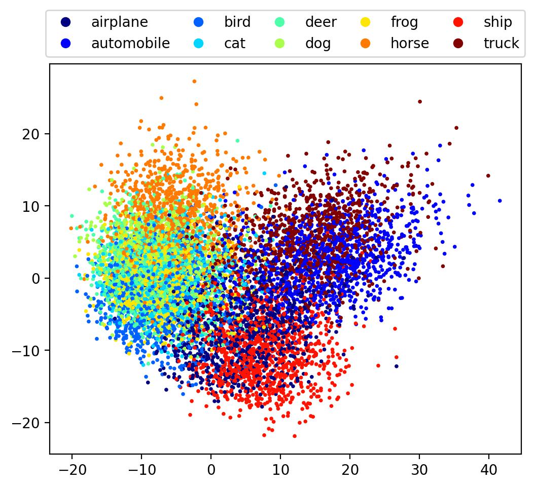
It can be seen that the classes are positioned roughly by similarity; ships with airplanes, automobiles with trucks, with the animal classes all grouped to one side. However, class boundaries are fuzzy and there is significant overlap, making it hard to infer any global structure. Let’s see how this plot compares with other methods.
t-SNE
The next method we will use is t-distributed stochastic neighbour embedding (t-SNE), a method for nonlinear dimensionality reduction that attempts to minimise the Kullback-Leibler divergence between two probability distributions; one that describes the similarities between points in the original high-dimensional data, and another for similarities between points in the low-dimensional embedding. Let’s go ahead and try it:
from sklearn.manifold import TSNE
embedding = TSNE(perplexity=50).fit_transform(denseout)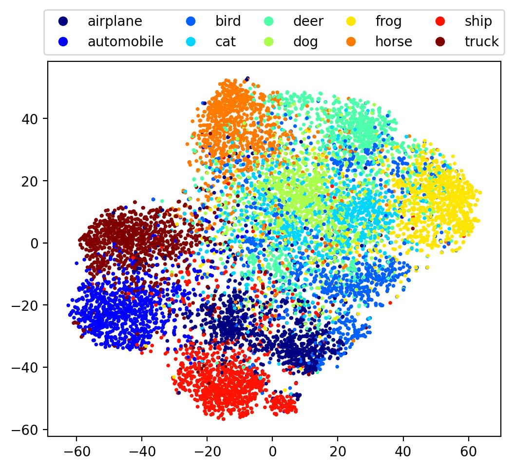
Here we see a somewhat better separation between classes, with the overall embedding beginning to embody some degree of finer, global structure. Let’s now use one more method, one specifically designed to visualise manifolds.
UMAP
Uniform Manifold Approximation and Projection for Dimension Reduction, a.k.a. UMAP, is a recently developed technique based on manifold learning and topological analysis. To get started, simply install the umap-learn package with pip (or conda-forge).
from umap import UMAP
embedding = UMAP(n_neighbors=30).fit_transform(denseout)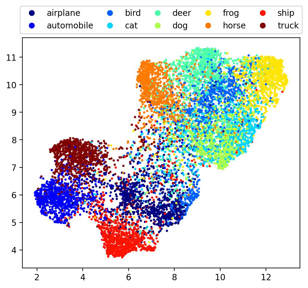
Here we see an ever more well-defined global structure, with firm boundaries for the embedding.
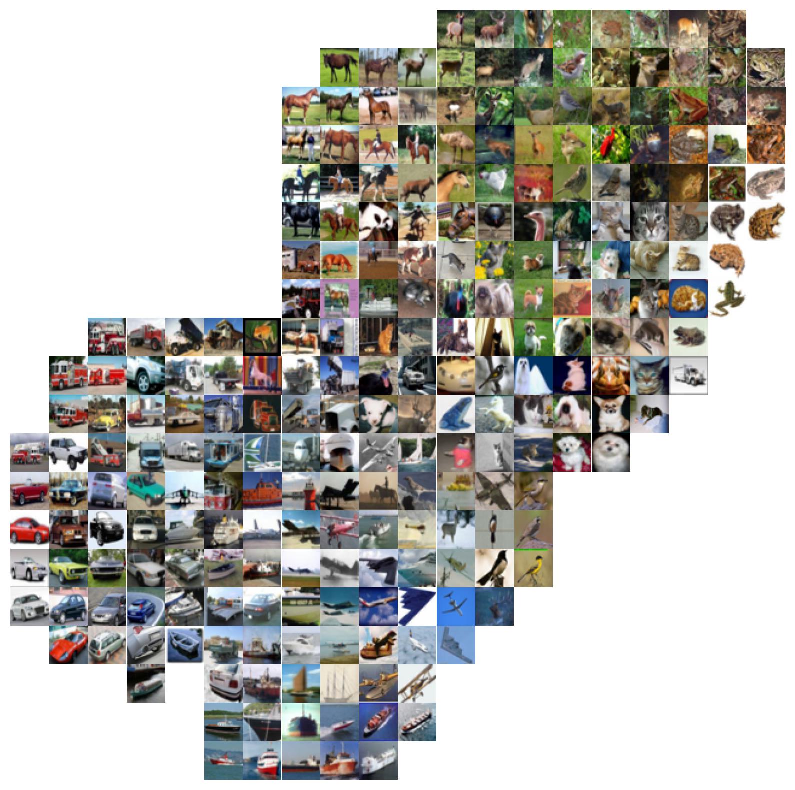
Creating an Image Atlas
While visualising the embedding has its uses, it’s better to see the images themselves. Let’s construct an image atlas. To do so, we’ll first construct a grid over the embedding. Then, for each grid point, we display the image corresponding to the closest data point in the embedding. To simplify things, let’s first normalise the embedding over each dimension, then construct our grid.
embedding[:,0] = (embedding[:,0] - np.min(embedding[:,0])) / np.ptp(embedding[:,0])
embedding[:,0] = (embedding[:,1] - np.min(embedding[:,1])) / np.ptp(embedding[:,1])

grid_x = np.linspace(0,1,20)
grid_y = np.linspace(1,0,20)
Here we will plot images in a 20×20 grid. Note the values for grid_y go from high to low: this is to ensure the same orientation as the above embedding plot (since axes subplots are indexed from top to bottom). Now, we simply iterate over all the grid points, find the data point in the embedding that is closest to this grid point, and plot the corresponding image from the dataset (recall in our case that this is X_test).
fig = plt.figure(figsize=(10,10))
ax = fig.subplots(nrows=20, ncols=20)
fig.subplots_adjust(wspace=0,hspace=0)

# only show an image if the gridpoint is at most this far from the embedding
# this helps to remove duplicate images for points near the edge
max_distance = 0.05

for i,y in enumerate(grid_y):
    for j,x in enumerate(grid_x):
        # np.linalg.norm is used to calculate the Euclidean distance between points
        closest = min(enumerate(embedding),key=lambda e: np.linalg.norm(e[1]-(x,y)))
        distance = np.linalg.norm(closest[1]-(x,y))
        if distance < max_distance:
            ax[i,j].imshow(X_test[closest[0],...])
        ax[i,j].axis('off')
plt.show()
This yields the following image atlas, which clearly illustrates where images of different classes lie within the embedding.
Conclusion
In this post we’ve seen how it’s possible to visualise the latent space of a convolutional neural network through extracting the outputs from one of its intermediate layers (in our case, the penultimate layer), and then reducing its dimensionality to obtain a 2-dimensional embedding. With this embedding, we can construct an image atlas, allowing us to clearly visualise gives how the data is grouped and structured within the latent space. In the process, we gained some insight not only on how CNNs represent data, but also how different statistical techniques can yield vastly different embeddings.
Of course, there are plenty of techniques for performing dimensionality reduction; the three discussed in this post are merely the tip of the iceberg. While UMAP performed the best (insofar as it produced an aesthetically pleasing embedding), it’s important to keep in mind that each technique has advantages and disadvantages that make them better suited for certain use cases above others, so it’s worth stressing that these embeddings are simply that; embeddings. Furthermore, we mostly stuck to the default function parameters for each method, while in practice these methods typically have many options that, when tweaked, can produce markedly different embeddings (e.g. number of nearest neighbours to approximate, learning rates, distance metrics, etc). As such, these embeddings should be treated purely as visualisations that approximate the intrinsic distributions of the datapoints within the original latent space.
Further Reading
- For a similar visualisation technique, check out distill.pub’s excellent article on activation atlases.
- For some large-scale image atlases of the ImageNet dataset, check out Andrej Karpathy’s post.
Also check out the following large-scale visualisations that were created using some of the techniques discussed in this post:
- Paperscape, a 2D map of over 2 million arXiv papers created with t-SNE.
- The Open Syllabus Galaxy, a 2D map of over 1 million prescribed texts from various college-level syllabi, created with UMAP